
What "Production Grade" Actually Means (Part 4/5)
Consistent UIs aren't enough. I needed production-ready code on the first try, every time.

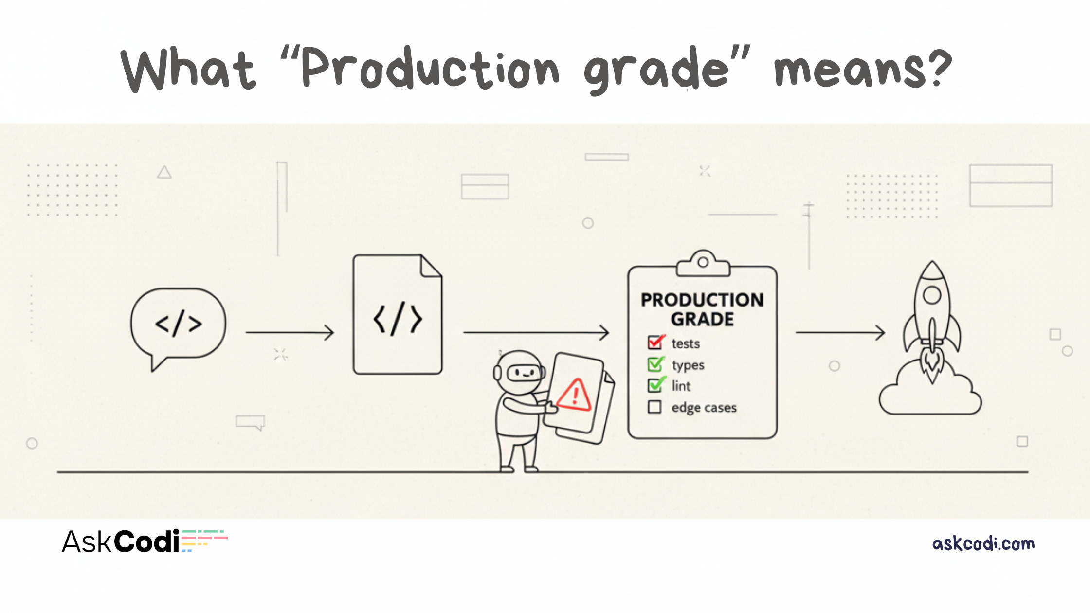
Why consistency isn’t enough, and how I built a quality bar into the system
[Previously: I discovered that small models with UI Intent match frontier models without it. GLM-4.5 (free) produced the same quality as Claude-Sonnet-4.5 (expensive). But there’s more to the story.]
Consistency Isn’t Enough
After seeing GLM-4.5 match Claude-Sonnet-4.5’s output quality, I thought I was done.
But then I looked closer at what the AI was generating:
function App() {
  return (
    <div className="flex flex-col items-center justify-center min-h-screen p-8">
      <h1 className="text-4xl font-bold mb-4">Welcome to Our Product</h1>
      <p className="text-gray-600 mb-8">Lorem ipsum dolor sit amet</p>
      <button className="px-6 py-2 bg-blue-500 text-white rounded">
        Click Me
      </button>
    </div>
  );
}
Consistent? Yes.
Production ready? No.
Problems:
Generic “Welcome to Our Product” headline
Lorem ipsum placeholder text
No hover/focus/active states on button
No loading/error/empty states
Hardcoded colors (not theme tokens)
Not accessible (no semantic HTML)
Not responsive (fixed padding)
Centered div template (uninspired)
UI Intent ensured the right type of UI was generated. But it didn’t ensure the UI was actually good.
I needed to raise the quality bar.
Building a Quality System
To achieve production-grade output consistently, I embedded a quality bar into the system prompts.
1. DO NOT SHIP DEMOS
The first rule: No placeholder anything.
❌ Forbidden:
Lorem Ipsum or placeholder text
Fake data (”John Doe”, “user@example.com“)
Non-functional mock UIs
Generic template layouts
Random decorative icons
✅ Required:
Realistic example data
Specific, meaningful copy
Functional interactions with state handling
This alone eliminated 80% of the “AI slop” problem.
2. State Handling Patterns (MANDATORY)
Every component that involves async operations or user data MUST handle:
Loading States: Spinner with “flex items-center justify-center” pattern
Empty States: Helpful messaging + “Create Item” CTA
Error States: Red background with error message
Success States: Green background with confirmation
Example:
const [isLoading, setIsLoading] = useState(false);
const [error, setError] = useState(null);
const [data, setData] = useState([]);

{isLoading && <LoadingSpinner />}
{error && <ErrorMessage error={error} />}
{!isLoading && !error && data.length === 0 && <EmptyState />}
{!isLoading && !error && data.length > 0 && <DataList items={data} />}
3. Tasteful Interactions (MANDATORY)
Every interactive element MUST have proper affordances:
Buttons: hover:bg-primary-dark active:scale-95 focus:ring-2
Links: hover:text-primary-dark hover:underline focus:ring-2
Cards: hover:border-primary hover:shadow-md transition-all
Inputs: focus:ring-2 focus:ring-primary hover:border-gray-400
Guidelines:
Use
transition-all duration-150ortransition-colors duration-150Hover states subtle but noticeable (darker shade, border change, shadow)
Focus states MUST be visible (ring, outline, or border change)
Active states provide feedback (scale down, brightness change)
Avoid over-animation (no spinning, bouncing, excessive motion)
4. Product-Type Heuristics (CRITICAL)
Design choices MUST align with product type from Design Profile:
Landing Page: Hero → features → social proof → CTA, spacious (py-16 md:py-24), single primary CTA
Dashboard: Sidebar/top nav, data-dense (cards, tables, charts), compact (py-4 md:py-6), filters/search
SaaS App: Hybrid (marketing + app), onboarding flows, settings panels, balanced (py-8 md:py-12)
Internal Tool: Function-first, dense forms, keyboard shortcuts, very compact (py-2 md:py-4)
5. Design Self-Check (INTERNAL)
Before finalizing response, AI runs internal checklist (not shown to user):
☐ Visual Hierarchy: Clear size/weight/color differentiation?
☐ Spacing Consistency: Used Tailwind scale consistently (4, 6, 8, 12, 16, 24)?
☐ State Handling: Implemented loading/empty/error states?
☐ Interaction Affordances: All buttons/links have hover/focus/active?
☐ Accessibility: Focus states visible? Semantic HTML? Click targets 44px minimum?
☐ Responsiveness: Mobile first? Breakpoints make sense?
☐ Product-Type Alignment: Layout matches product type?
☐ No Placeholders: All copy specific and meaningful?
☐ No Generic Layouts: Avoided centered div templates?
☐ Design Profile Compliance: Followed layout strategy, navigation rules, component allowlist/blocklist, anti-patterns, quality checklist?
If any item is ✗, revise before responding.
Before and After: Real Code
Let me show you the difference.
Before Quality Bar
function App() {
  return (
    <div className="flex flex-col items-center justify-center min-h-screen p-8">
      <h1 className="text-4xl font-bold mb-4">Welcome to Our Product</h1>
      <p className="text-gray-600 mb-8">Lorem ipsum dolor sit amet</p>
      <button className="px-6 py-2 bg-blue-500 text-white rounded">
        Click Me
      </button>
    </div>
  );
}
Issues:
Generic headline
Lorem ipsum
No states
Hardcoded colors
No accessibility
Centered div template
After Quality Bar
function App() {
  const [isLoading, setIsLoading] = useState(false);
  const [error, setError] = useState(null);

  return (
    <div className="min-h-screen bg-white dark:bg-gray-900">
      <header className="border-b border-gray-200 dark:border-gray-800">
        <div className="max-w-6xl mx-auto px-4 py-4 flex items-center justify-between">
          <div className="text-xl font-bold text-gray-900 dark:text-white">
            TaskFlow
          </div>
          <button
            className="px-4 py-2 bg-blue-600 text-white rounded-lg
              hover:bg-blue-700 active:scale-95
              focus:outline-none focus:ring-2 focus:ring-blue-600 focus:ring-offset-2
              transition-all duration-150 min-h-[44px]
              disabled:opacity-50 disabled:cursor-not-allowed"
            disabled={isLoading}
          >
            {isLoading ? 'Loading...' : 'Get Started'}
          </button>
        </div>
      </header>

      <main className="py-16 md:py-24">
        <div className="max-w-6xl mx-auto px-4">
          {error && (
            <div className="mb-6 p-4 bg-red-50 dark:bg-red-900/20
              border border-red-200 dark:border-red-800 rounded-lg">
              <p className="text-red-800 dark:text-red-200">{error}</p>
            </div>
          )}

          <section className="text-center mb-16">
            <h1 className="text-4xl md:text-6xl font-bold
              text-gray-900 dark:text-white mb-6">
              Manage Projects Without the Chaos
            </h1>
            <p className="text-lg text-gray-600 dark:text-gray-300
              mb-8 max-w-2xl mx-auto">
              TaskFlow helps teams organize, track, and ship projects
              faster with intuitive workflows.
            </p>
          </section>
        </div>
      </main>
    </div>
  );
}
Improvements:
Realistic product name and copy
Loading and error states
Proper interaction states
Theme tokens
Semantic HTML
Responsive spacing
Accessibility (focus rings, 44px touch targets)
Thoughtful layout
This is the difference between functional code and production-ready UI.
The Impact in Numbers
I ran metrics before and after adding the quality bar:
Before quality bar:
~40% of outputs needed refinement for production readiness
State handling coverage: 23% (most components missing loading/error states)
Accessibility violations: 67% (no focus states, wrong HTML tags)
Generic templates: 89% (centered div heroes everywhere)
After quality bar:
~8% needed refinement (5x improvement)
State handling coverage: 94% (all async operations handle states)
Accessibility violations: 12% (mostly edge cases)
Generic templates: 5% (product-specific layouts by default)
The quality bar eliminated most iterations. Users got production-ready code on the first try.
Real-World Test: E-Commerce Product Page
I ran a side-by-side test with a complex requirement:
Prompt:
“Build an e-commerce product page with image gallery, add-to-cart, reviews section, and related products.”
Without UI Intent (GPT-5.1)
Generated:
Generic product page template
Hardcoded product data
No loading states for async operations
Cart button with no disabled state
Reviews section but no empty state
Related products as static grid
Missing hover states on product cards
No error handling for failed image loads
Time to production ready: 8 to 10 iterations, ~20 minutes
With UI Intent (GLM-4.5)
Generated:
Product-specific layout (not generic template)
Realistic product data
Loading states for cart operations
Cart button with loading/disabled states
Reviews with empty state (”Be the first to review”)
Related products with lazy loading
Proper hover/focus states on interactive elements
Error boundaries for image failures
Time to production ready: 1 iteration, ~3 minutes
The small model with UI Intent was faster, cleaner, and more complete than the large model without it.
Why This Works
1. Code Examples in Prompt
The AI sees exact patterns to follow, not abstract descriptions. Instead of “add hover states”, it sees hover:bg-blue-700 active:scale-95.
2. Visual Hierarchy in Prompts
Unicode borders and emojis create visual weight, increasing LLM attention to critical sections.
3. Self-Check Protocol
Forces AI to validate output before responding. Catches issues before generation.
4. Explicit Forbidden List
Easier to avoid patterns than to follow vague positive guidance. “Never use lorem ipsum” is clearer than “use meaningful copy”.
5. Tailwind Specific
Shows exact classes to use (min-h-[44px], transition-all duration-150). No ambiguity.
It Actually Works Everywhere
The consistency wasn’t limited to dashboards or specific use cases. It worked across every product type I tested.
Landing pages stopped being generic heroes with gradient buttons. Instead, each model produced the same sectional flow: hero → features → social proof → single CTA. The visual style varied a bit (some models preferred softer shadows, others went with cleaner borders) but the structure was rock solid.
Internal tools lost all their marketing fluff. Every model immediately went compact and functional. Forms, tables, minimal decoration. Dense spacing. No authentication prompts when the intent said no_authentication. No random features appearing out of nowhere.
And vague prompts? They finally worked. I could say “build something for my startup” and get a proper B2B landing page instead of a dashboard with a pricing table attached. The intent filled in what I meant without me having to spell out every detail.
This wasn’t just consistency within one model. This was consistency across all models, even the tiny ones.
The Rethinking
This experience changed how I think about AI-assisted development.
The Traditional Narrative:
Bigger models are better
More parameters = higher quality
Spend more on API costs for better results
Wait for GPT-5 or Claude-4 for major improvements
The UI Intent Narrative:
Constraints unlock capability
Small models + good constraints > large models + vague prompts
Invest in design systems, not bigger models
Quality comes from structure, not just scale
This has massive implications:
1. Cost Reduction
If GLM-4.5 (free) produces the same quality as Claude-Sonnet-4.5 (15to15to60 per million tokens), the cost savings are enormous.
For AskCodi users:
Before: 50to50to200/month on API calls for prototyping
After: 0to0to20/month, same quality output
2. Democratization
Developers in regions with limited access to expensive APIs can now produce the same quality UIs. Small teams and indie hackers aren’t disadvantaged by budget constraints.
3. Speed
Small models are faster. GLM-4.5 generates responses 2x to 3x faster than GPT-5.1. With UI Intent ensuring quality, you get speed without sacrificing output.
4. Privacy
Open-source models can run locally. With UI Intent, local models produce production-grade UIs. You can build entire products without sending code to external APIs.
5. Specialization
UI Intent is a domain-specific constraint system. Imagine similar systems for API design, database schemas, component libraries, testing patterns.
We’re seeing a new pattern: Constrained AI beats general-purpose AI.
Continue to Part 5: The Future
In the final post, I’ll share how to use UI Intent in AskCodi, what’s coming next, and the broader vision for domain-specific constraint systems.
This is Part 4 of a 5-part series on building UI Intent. I’m Sachin, founder of AskCodi, and I’m showing you what production-grade AI output actually looks like.